Train This Much – Fitness
mobile app
Scope
UX/UI design, Brand identity
My Role
Visual Designer, Brand designer, UX designer
What was the project about?
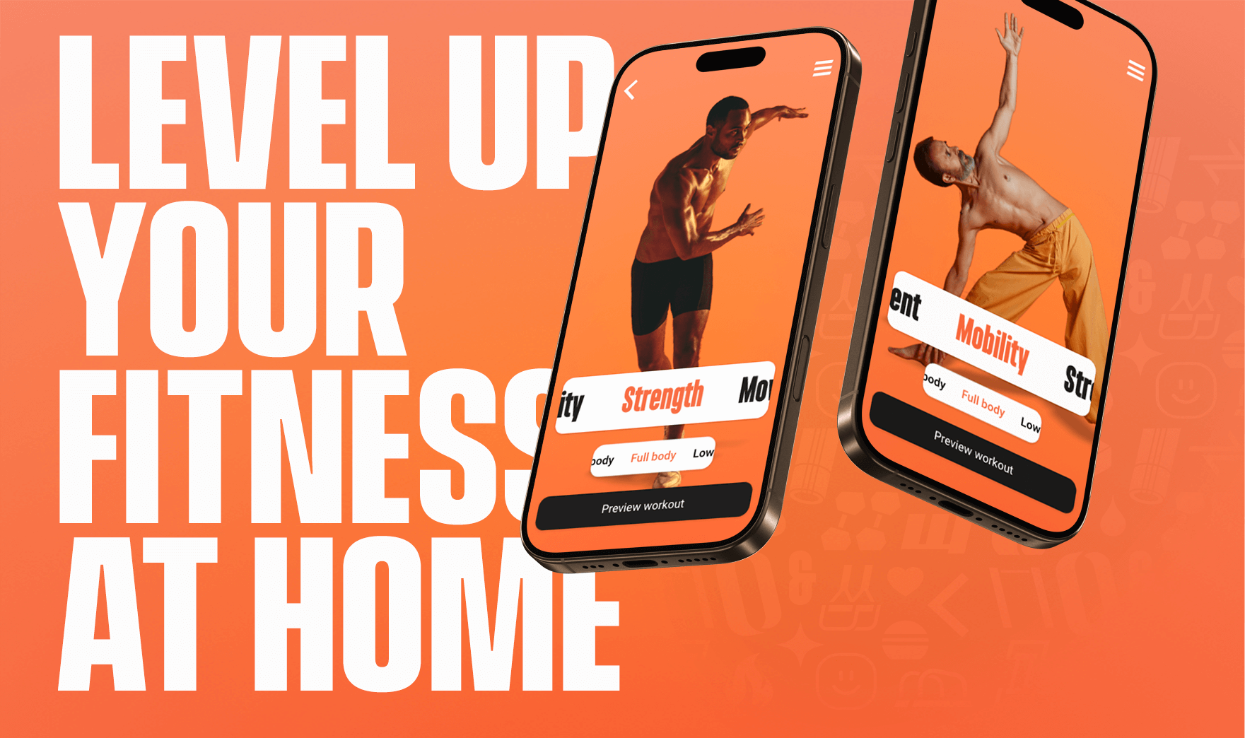
A small team of friends and I were developing a fitness mobile application.
As the developer and two other team members have degrees in physical education, they had a clear vision of what they wanted to create: an application based on progressive levels of exercise.
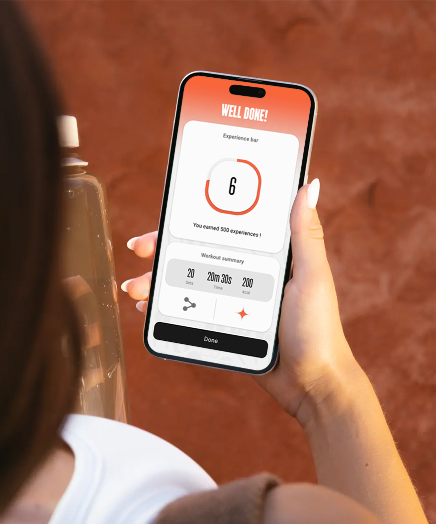
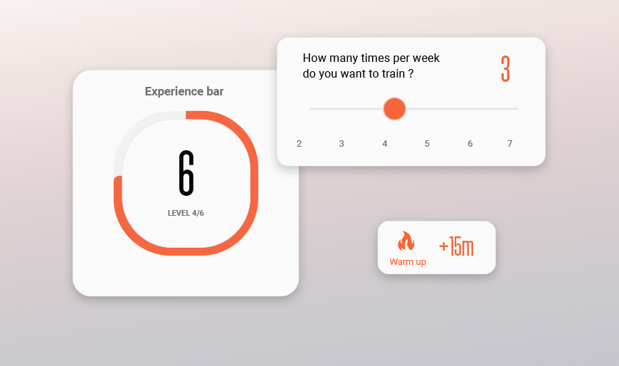
Higher levels represent more challenging workouts, tailored to the user’s personal plan. Users can choose whether their goal is to lose weight or gain muscle, progressing through the app while also developing real-life physical skills.
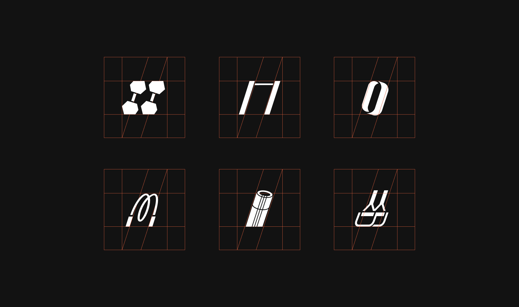
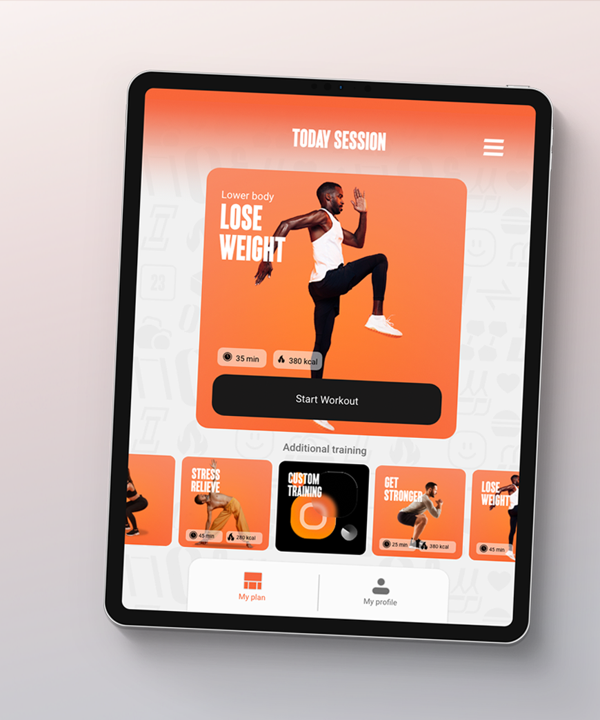
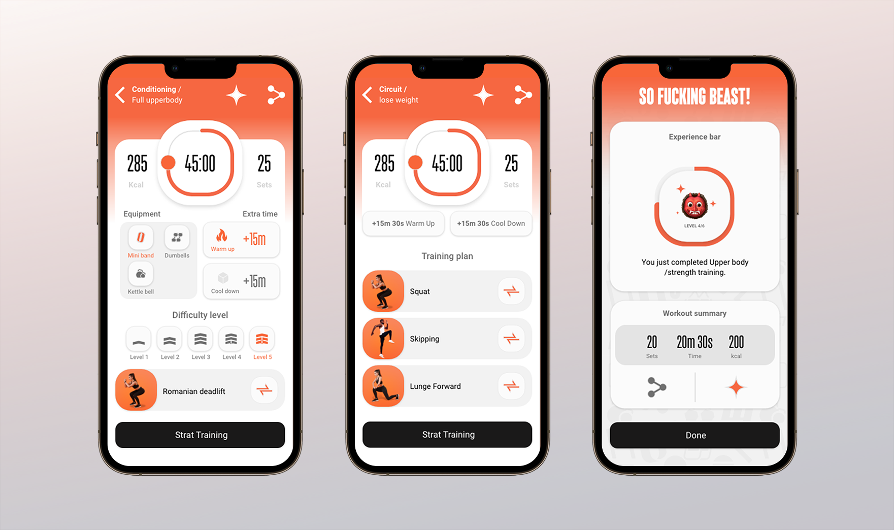
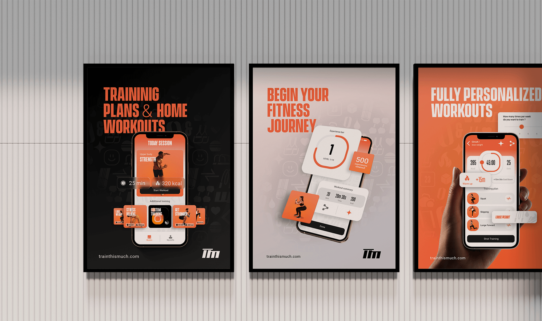
I worked on this project as a visual designer, covering the entire UI of the application as well as the marketing materials for app stores. The logo and overall branding were also my responsibility.
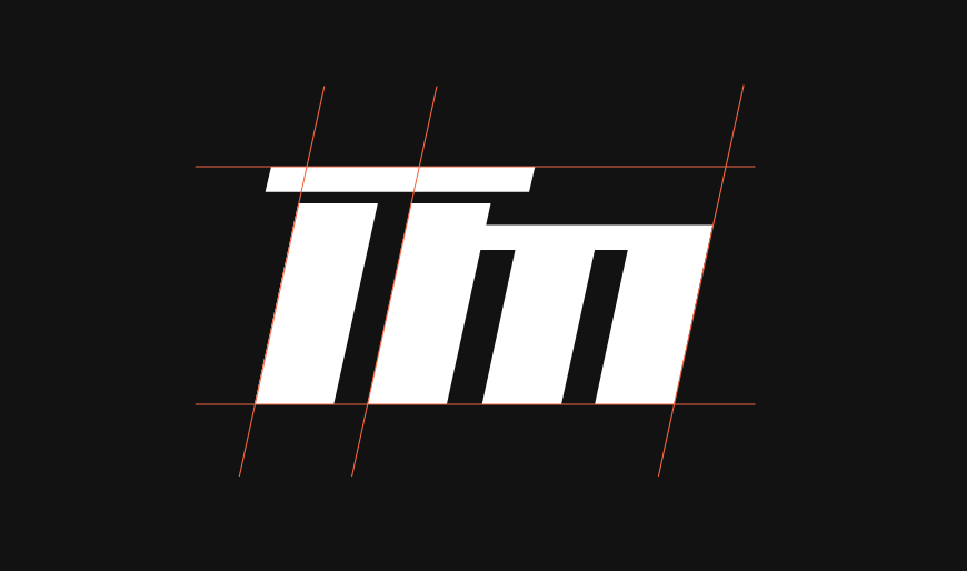
“TTM” – logotype represents a calisthenics bar integrated into the letter “T.” Mood of the logotype has a subtle dynamic angle to reflect movement. Orange color was chosen as the primary accent color to represent energy.