Ohpen – Dutch Cloud provider
of the banking products
Scope
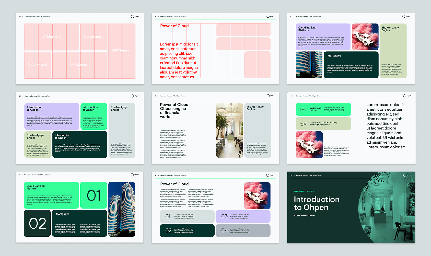
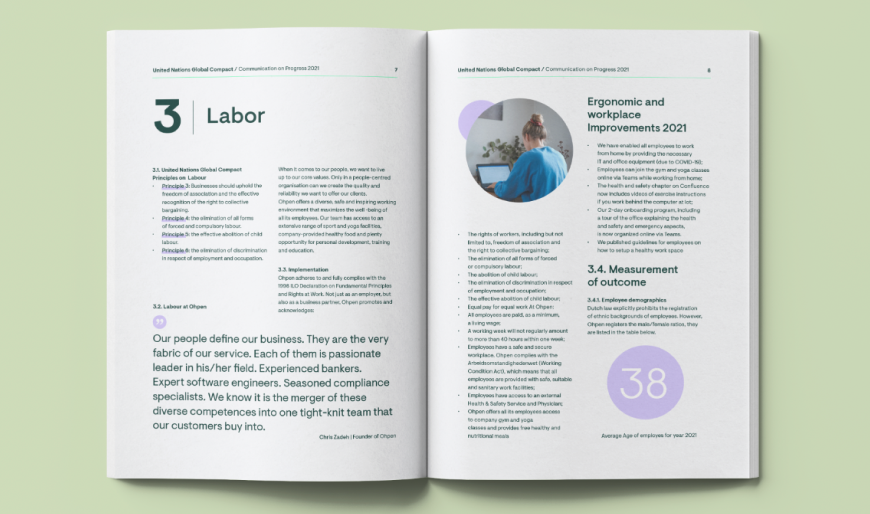
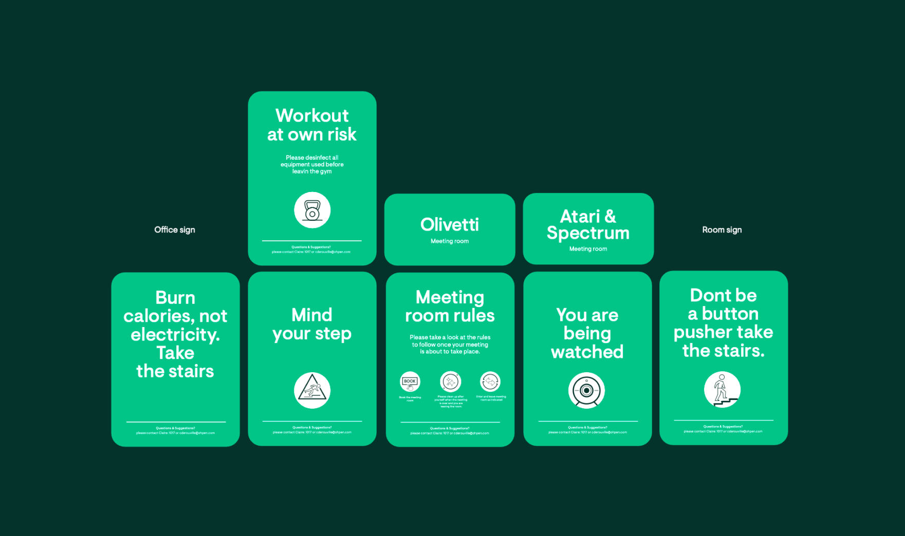
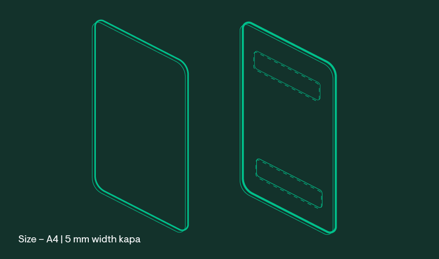
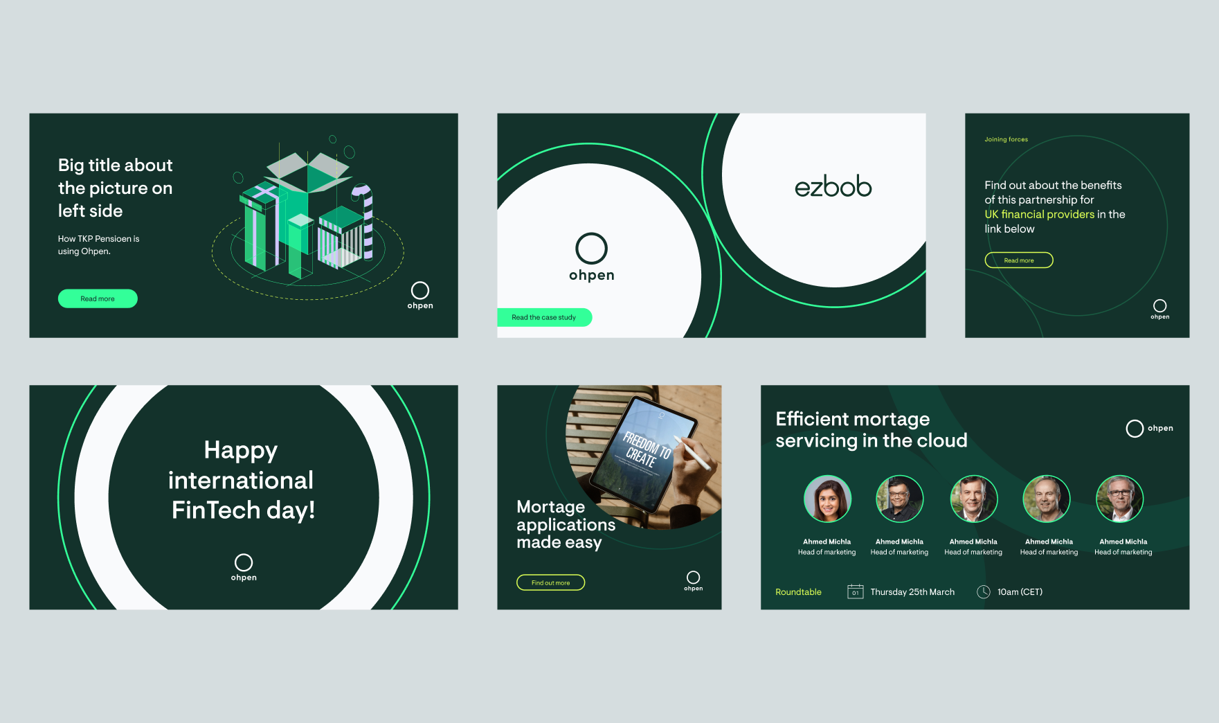
Brand Identity, Social media, Print materials.
My Role
In–house Brand designer. (I was solo on this project)
What was the project about?
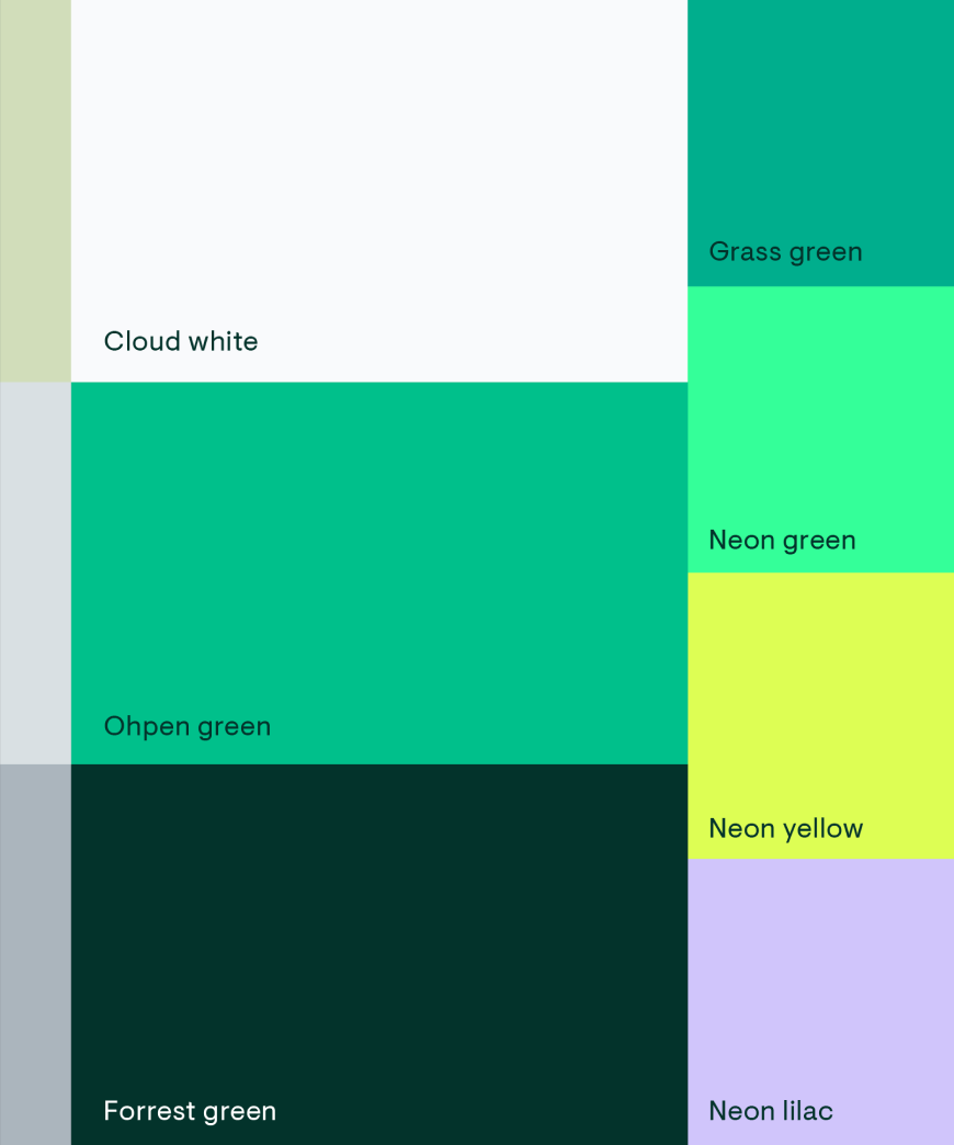
Ohpen is a cloud-native core banking platform that powers lending, mortgages, savings, investments, and pension products. My main challenge was to create a coherent visual language based on a few already existing elements, such as the logo and color palette. This visual identity needed a clear story that is connected directly to the product and the brand itself.
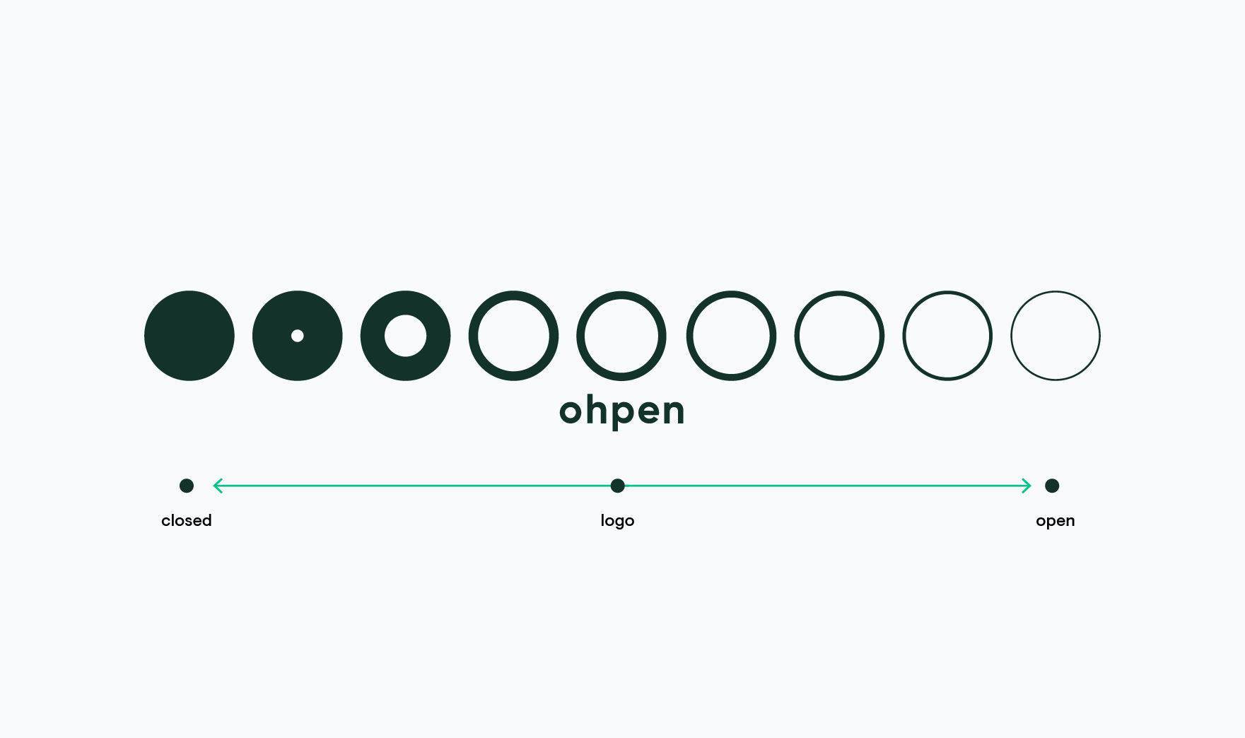
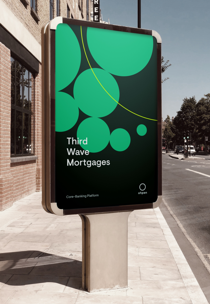
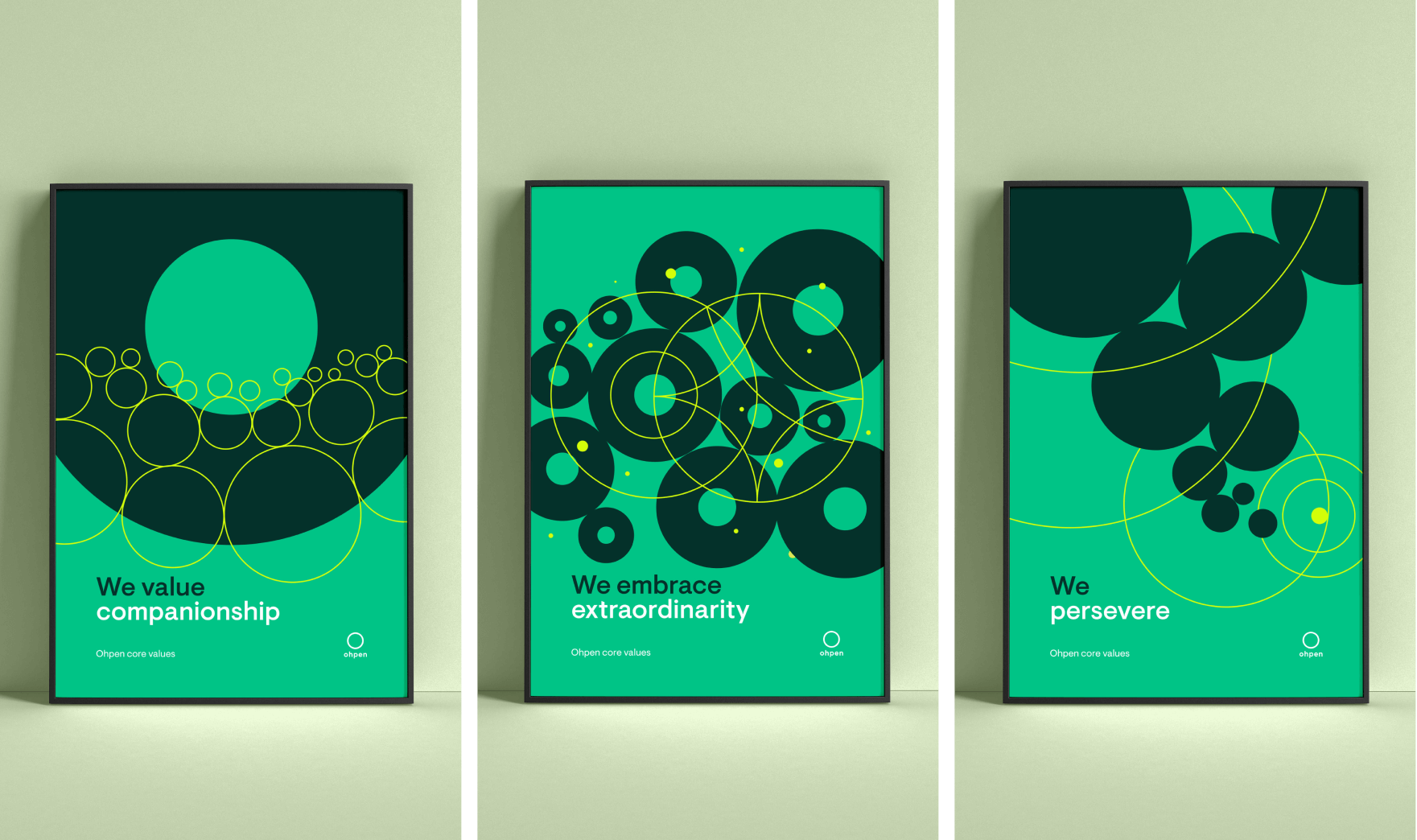
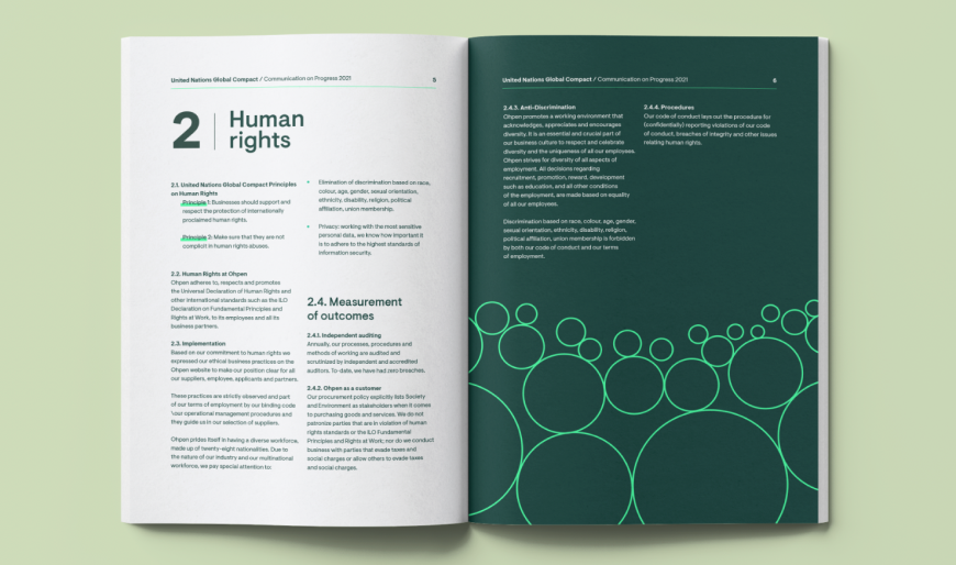
The core concept was based on circles of varying thickness — open circles and full circles. These elements could be combined to create graphics that support the brand’s content. The idea of “opening” refers to creating open space for bank clients, reflecting Ohpen’s role as a cloud platform.
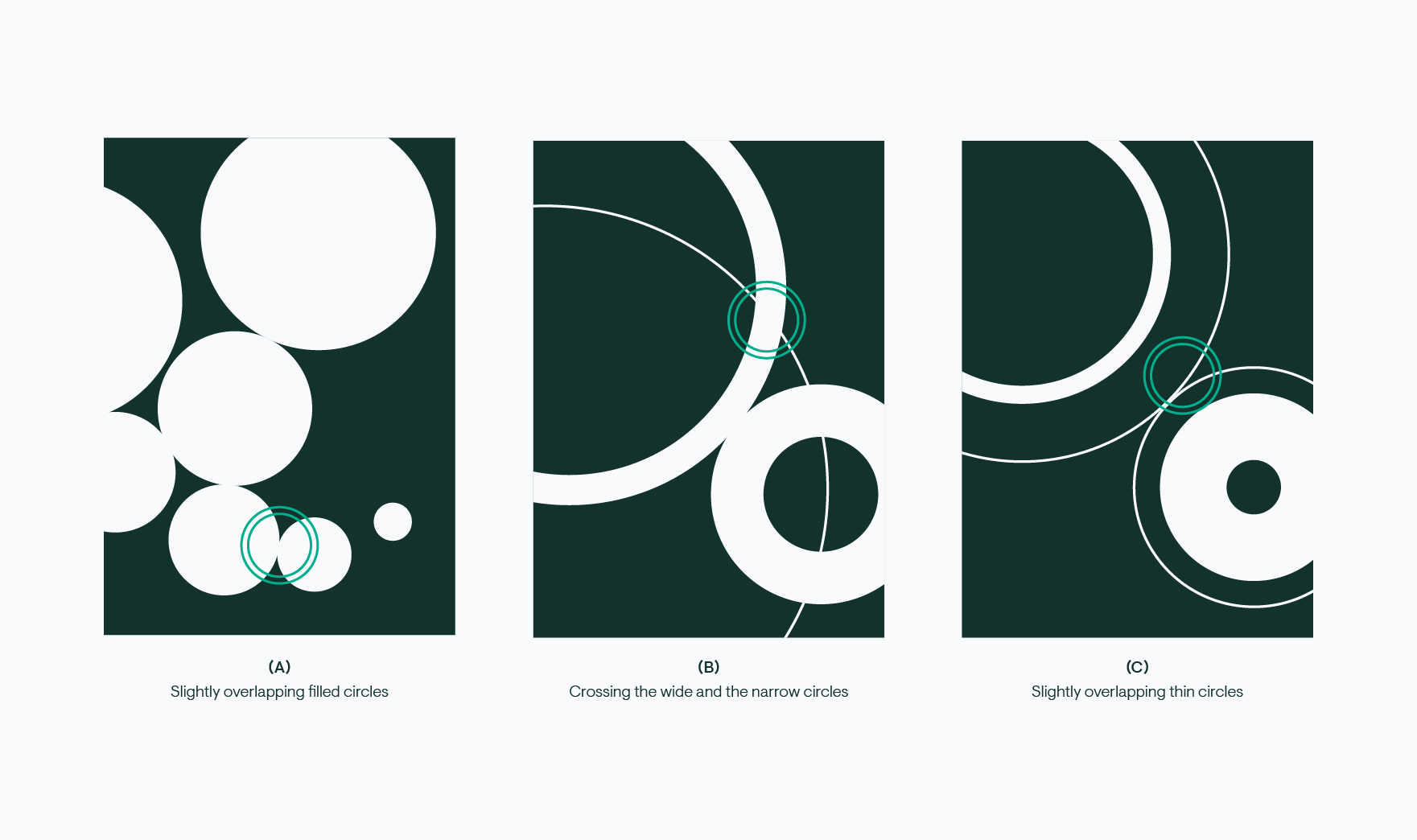
The visual approach remains simple and shape-based, while still conveying a digital, technology-driven feel. The key visual principle is the connection and intersection of circles with different line weights. This system allowed the creation of both patterns and illustrations from a single visual logic.